Current Housing Market

New important data has been published by the National Association of Realtors. Data we should keep in mind even if you are neither buying or selling a house nor investing in the sector; simply because it is an indicator of how the economy is performing. The housing market and the economy are interlocked in many ways. As we will see later, some of these barometers have become widely used and respected by many professionals.

In the United States, home prices hit a new record in April of $391,200 going back to 1999. At the same time, existing home sales slipped 2.4% from previous month–and 5.9% from a year earlier–as Real Estate markets adapt to the new rising rates dictated by the FED.

This data, per se, cannot give you a clear picture of what the situation currently is. We can understand that demand is still higher than supply and pushes prices up. Raising interest rates complicate mortgage acquisitions for many potential–and already early–home buyers, and the situation should begin to slow down in the near future. In the meantime, the Housing Affordability Index, which measures the degree to which a typical family can afford the monthly mortgage payments on a typical home, has decreased by over 19% since last year. But let’s have a look at other three indicators that might help us see the bigger picture and what could they mean for the future.

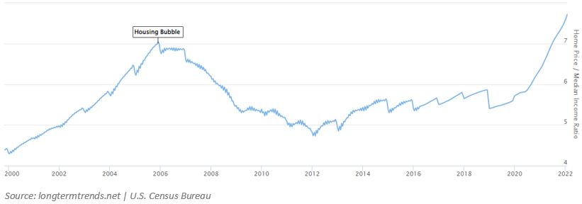
The first one we will examine is the Home price-to-median household income ratio. The name of the ratio explains itself, but to interpret the chart below we must know that, historically, an average house in the U.S. cost around five times the yearly household income. Before the burst of the last housing bubble, in 2006, this ratio went to exceed 7; or in other words, the average single-family house in the U.S. cost over 7 times the median annual household income in the country. Isn’t it scary to think that the last data contained in the chart, from February, has already surpassed the famous housing bubble? Especially after knowing from the NAR that home prices just hit in April a new price record. Although inflation pushes both home prices and salaries up, the latter is usually negotiated long term, and doesn’t change as much as the former. Thus, it is likely that the greater change in the nominator than in the ratio’s denominator has taken it to an even higher level.

Home price - Median household income

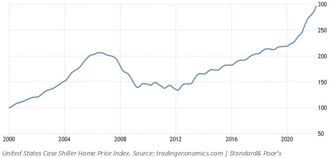
The next indicator we will look at is the S&P/ CoreLogic Case-Shiller Home Price Index, also simply known as the Case-Shiller Home Price Index. It is made up of several indexes and measures the change in value of the U.S. residential housing market by tracking the purchase prices of single-family homes that have undergone at least two arms-length sale transactions. In real estate, an arm’s length sale transaction refers to a deal where the parties involved do not have any prior relationship, which might affect the final sale price of the home by going below the market value. Furthermore, it uses the repeat sales methodology to gauge the appreciation or depreciation of all housing in a particular geo-market. This methodology is not perfect though, as some of those housing units will be improved or deteriorated between sales. Albeit missing these structural changes, it is considered a more reliable data than other methodologies that simply review sales prices, and is generally considered the leading measure of U.S. residential real estate prices.

Home Price Index
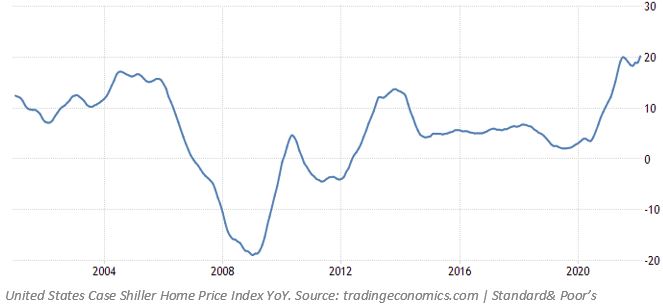
Home Price Index YoY

In the first chart, we see the index as a whole, higher than ever. But to see the percentage change year-over-year we must have a look at the second one. As we can see in it, this home price index surged 20.2% from a year earlier in February 2022. This was above market expectations and is now the greatest surge on record. It stands higher than, again, the previous record high back in August 2004, before the last housing bubble burst.

As is well documented by many academic references, historic data reveals correlation between property prices and inflation. In the chart below we see the inflation rate since 2000, and how the ups and downs occur at certain similar periods, such as the inflationary market we currently find ourselves.

Inflation Rate

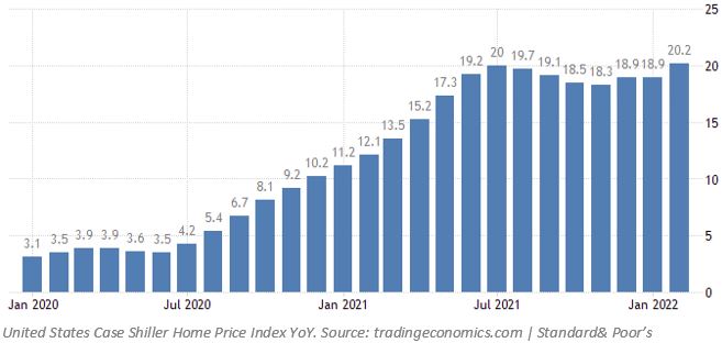
We can compare the correlation between the Case-Shiller Home Price Index YoY and the inflation rate, starting in 2020, from a closer perspective in the two charts below.

Home Price Index YoY2

As we see, the COVID-19 impact on the economy caused a severe negative effect on the inflation rate due to revenue shortfalls, massive layoffs, financial distress and even deaths. It took roughly a year to recover from previous levels. It wasn’t nonetheless the same case for the Home Price Index. Property prices started rising way before inflation could reach above average levels. At that time, it was primarily most likely due to supply-chain issues. Issues like this, alongside other macroeconomic indicators, like unemployment, labor constrains, and nominal interest rates, can explain those periods where home prices and inflation do not go hand in hand. More recently, the real estate market is waiting for further increases in interest rates, which affect negatively property prices. On the one hand, people can’t borrow money to buy homes as cheaply as before; on the other hand, these higher interest rates are expected to cap this rise in inflation. For now, the costs of construction can be met with higher rent, which can generally be applied only to luxury or Class A developments. This situation leads many individuals and couples to find accommodation among the remaining and more affordable types. This, in consequence, generates a surge in demand. According to realtor.com, April saw a record rise of 17% from previous year in the median U.S. rent. Considering that neither of the consequences of the Federal Reserve decisions are therefore positive for the real estate market, at some point this unpleasant environment for the consumers will stop, and property prices should reverse.

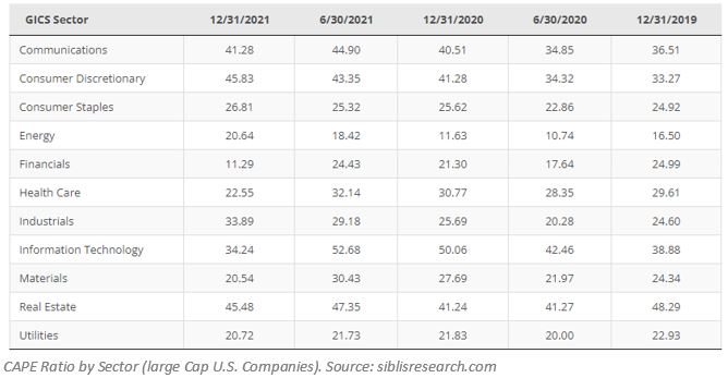
Lastly, using the last data available, we can see below where the CAPE ratio by Sector is at compared to the rest of the sectors. We can quickly sum up the Cyclically Adjusted PE ratio by saying that is a valuation measure that uses earnings over a 10-year period to smooth out fluctuations occurred during business cycles. An extremely high ratio indicates that the company’s price is significantly more expensive than the company’s earnings; or in other words, it is overvalued. And such is the case we see now. It is recently the most overvalued sector alongside Consumer Discretionary.

CAPE Ratio by sectore

While the Real Estate sector stood at the end of December 2021 at 45.48, the overall market ratio stood at 36.94. During the last two decades, the greatest CAPE ratios for the overall market registered the largest values at the end of May 2007 at 27.42, end of December 2004 at 27.66, and end of November 1999 at 44.19. Again, this ratio is able to reveal a more expensive overall market than during the housing bubble.

NYU’s Stern School publishes PE data for different industries. It breaks Real Estate into four categories and lists their current PE ratios as of January 2022 as follows:

REITs: 118.59

Real estate development: 270.18

General and diversified real estate: 34.41

Real estate operations and services: 91.59

It is interesting to see which categories are particularly overpriced. As mentioned above, considering the current market conditions, it is more than likely that the greater ratio in development companies comes from the increase in prices from supply chain and labor shortages.

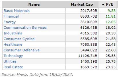
More recent data from Finviz, and using plain PE ratios, shows the most expensive sector in the market.

PE by sector

In conclusion, we can clearly see an overheated housing market, recently fuelled by a shortage in supply and larger demand, negative real interest rates, supply-chain issues, and labor shortages. In order to tame inflation, the Federal Reserve is raising nominal interest rates, which undeniably affects negatively home prices, pulling them back to the mean. According to the National Association of Home Builders, the contribution in the U.S. of housing to GDP generally averages 15-18%. As a big contributor, what happens in the sector has strong repercussions on the market. For us to protect our capital and wealth, it is important to follow it closely and try to predict in advance where it might go. It seems that sooner than later we will see the party end and new buying opportunities will arise.


By continuing to use this site, you agree to the use of cookies. More information

Los ajustes de cookies en esta web están configurados para «permitir las cookies» y ofrecerte la mejor experiencia de navegación posible. Si sigues usando esta web sin cambiar tus ajustes de cookies o haces clic en «Aceptar», estarás dando tu consentimiento a esto.


Cerrar